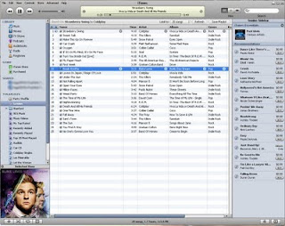
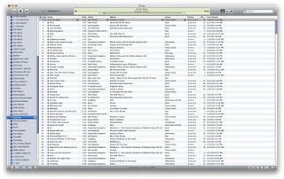
First, I don't care for the new play and forward/rewind buttons. In fact, the entire top of the app looks more plastic-y than before. It also seems as though the interface has taken a step backward in terms of the contrast of such things as the volume slider and the track playing indicator window. There's too much contrast now, making it difficult to look at. I really, really liked the contrast of iTunes 8. See here:
Before (iTunes 8)

After (iTunes 9)

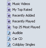
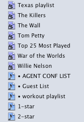
There are also new icons in the sidebar. The new huge, dark gear on the smart playlist icon is hard on my eyes, especially when presented with dozens of other smart playlists, as I have in my iTunes library. The colors are now also darker and harder to differentiate at a glance, such as when you're scrolling through a huge list of playlists (which I do regularly.)
Before:

After:

And finally, but certainly not least - Apple has changed the functionality of the green button (Mac only) in the top left corner. Previously, clicking it would collapse the main window down to the mini player, which is how I keep it when I'm working. But in iTunes 9, to get the mini player, you now either have to option-click or shift-command-m.
This is cumbersome to me because there are a lot of times when I'll maximize my window with a click to check out a track or to see either what just played or what's next. Then I'd just click the green button again to send it back to the mini player. Now I have to involve my left hand to make the move. When I'm reading an article on the web or designing, most times I'm sitting back with only my right mouse hand engaged. I guess I could just click up to the menu bar and select the menu option, but I also hate using the menu bar if I don't have to.
And this new change in functionality isn't implemented very well. The first time I tried to collapse to the mini-player, clicking the green button just made the iTunes window jump around the screen. I actually had to go out to the web and search around for awhile before I found out that I now had to option-click.
Also, it took me way too long to figure out how to engage the wish list feature on the store. Previously, I used the shopping cart as a repository for songs that I plan to purchase someday. The new version does away with the shopping cart altogether and adds a wish list. I assumed that the wish list would be listed at the top of the store window under Quick Links, along with Redeem and Account. No such luck. There's also no way to access it under the Store menu in the menu bar. It turns out that the wish list is down at the very bottom of the store page under "manage." This seems like a very strange place to hide a repository list of items that you're planning on spending money on someday. It really should be at the top of the window, and it should probably even have a place in the sidebar with the store icon.
On a more positive note, the Home Sharing feature is going to be very welcome in my house. Our main iTunes library is on my computer in the office, and Kristi has some stuff on her laptop that she likes. but it's really a chore keeping it updated. We bought some music for her a couple of weeks ago, and it still hasn't made it onto her laptop because it required moving the actual files around in the finder and importing them into her iTunes library. I'm looking forward to her being able to pick exactly what she wants out of the main library and copy it to her Mac herself. She'll be happier with the results that way.
Genius mixes looks cool. It's the kind of thing I can see myself turning on on a Saturday and streaming through the house. I just wish it were a little more customizable, as in letting you pick which genres you wanted to create genius mixes from. The genius created five rock mixes, three alternative, one praise and worship, one easy listening and two country mixes. I know I have a wider selection of music than that. It would also be nice if you could see the songs that the playlist contained. But alas, I supposed that's what a regular genius list is for. It also seems weird that you can't rate - or change the rating - on a song when it's playing from a genius mix.
I supposed I'll get used to all these things, but my initial impression is that this release doesn't feel like an Apple product in its current state. Rather, it feels like an imitation based on iTunes.


No comments:
Post a Comment