
Hi James, |
We're trying out a new feature to reduce the amount of email you receive from Facebook. Starting today, we are turning off most individual email notifications and instead, we'll send you a summary only if there are popular stories you may have missed. |
You can turn individual emails back on and restore all your original settings at any time. |
Thanks, Dear Facebook, QUIT MESSING AROUND WITH MY SETTING, ESPECIALLY MY PRIVACY AND NOTIFICATION SETTINGS!!! It turns out that I LIKE getting e-mail when people send me messages or respond to my posts. It lets me know that I need to go out to Facebook to interact (because, no, I don't spend all day wasting time on your site.) You just keep disregarding the my preferences... I REALLY hate it when you change my feed to "Top Stories" instead of "Most Recent" without my knowledge. I despise it when, after I've gotten my privacy setting JUST the way I want them, you come along and start turning things back on again because you changed your privacy policy or added a new feature. And per your e-mail this morning, I don't want to have to go and turn things BACK ON. I want you to respect the settings that I've already chosen. Please leave your interface alone for awhile. Having to learn a new interface three or four times a year is REALLY annoying. I don't want you to put a chat bar on the left side of my screen. The old chat wasn't broken. I don't want lists on the right side of my screen. I hate having to search for my own photos. Change your interface maybe once a year, if then. I think you've got a pretty good interface going, but you keep monkeying with it, and most times I don't understand why. For instance, six months ago, when I clicked on a friend's photo, it took me to a photo page that looked like the rest of the site. Then about three months ago, when I clicked on the same photo, a black popup screen came up containing the photo. And now it's a white pop-up screen. And the worst part is that each of those three pages acts COMPLETELY differently. Ugh! I've been teetering on the edge of quitting you anyway. All these interface changes may just push me over the edge. No website should require this much work on my part. No website is worth the amount of energy I have to expend to keep trying to figure you out. I suppose you're trying to "stay fresh" and to innovate. Fine. Innovate, but please keep it to once a year or so. This constant monkeying is really pissing me off. -James [Edit 1] - Now I have to be on the lookout for little blue triangles????!!!?? What is this - an episode of Dora the Explorer? Oh, you DO know how to get at me, don't you?  AND HOW THE HELL DO YOU GET BACK TO "MOST RECENT?" AAAAAAAARGH!!!! [Edit 2] - And so now I have to click somewhere just to bring up a text box so I can post a status? There's no box waiting there, wondering what I'm thinking? WHISKEY TANGO FOXTROT, FACEBOOK?!?!?! |
Showing posts with label user interface. Show all posts
Showing posts with label user interface. Show all posts
Wednesday, September 21, 2011
Open Letter to Facebook
From Facebook, via e-mail:
Tuesday, March 22, 2011
Canon's Connection of DOOM

So, wait. I can't disconnect the USB or the power source while the camera is connected to the computer? But my camera is using battery power, so it is the power source. And if I can't disconnect the USB cable while the camera is attached to the computer, how am I supposed to go and shoot more video?
Does that mean I can never disconnect it ever again?
And I can't turn off the camera, either? Geez. Thanks, Canon.
Thursday, September 2, 2010
Breaking Guidelines
Apple has once again broken its own design interface guidelines, this time in iTunes 10. The red, yellow and green resize buttons are presented vertically, instead of horizontally (as they have been for ten years now).

After becoming accustomed to the location of the buttons over the past decade, it was quite jarring to have to actually think about the location of the button I wanted to click. If you recall, Apple changed the expected functionality of these buttons on their last version of iTunes as well, only to change it back after public outcry.
Geez, Apple. Come on, already... Don't just change user interface elements that are system-wide in one app on a whim.
Thursday, September 10, 2009
Rollover Comparison of iTunes 8 and iTunes 9
This site has a great way to check out the difference in the interface so you can decide for yourself and not have to take my word for it.
The Trouble with iTunes 9.0
I downloaded iTunes 9 today (a full day after it was available - I know, I'm so embarrassed) and have had a little difficulty initially.
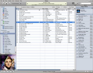
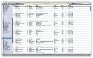
First, I don't care for the new play and forward/rewind buttons. In fact, the entire top of the app looks more plastic-y than before. It also seems as though the interface has taken a step backward in terms of the contrast of such things as the volume slider and the track playing indicator window. There's too much contrast now, making it difficult to look at. I really, really liked the contrast of iTunes 8. See here:
Before (iTunes 8)
After (iTunes 9)
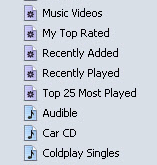
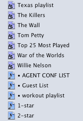
There are also new icons in the sidebar. The new huge, dark gear on the smart playlist icon is hard on my eyes, especially when presented with dozens of other smart playlists, as I have in my iTunes library. The colors are now also darker and harder to differentiate at a glance, such as when you're scrolling through a huge list of playlists (which I do regularly.)
Before:
After:
And finally, but certainly not least - Apple has changed the functionality of the green button (Mac only) in the top left corner. Previously, clicking it would collapse the main window down to the mini player, which is how I keep it when I'm working. But in iTunes 9, to get the mini player, you now either have to option-click or shift-command-m.
This is cumbersome to me because there are a lot of times when I'll maximize my window with a click to check out a track or to see either what just played or what's next. Then I'd just click the green button again to send it back to the mini player. Now I have to involve my left hand to make the move. When I'm reading an article on the web or designing, most times I'm sitting back with only my right mouse hand engaged. I guess I could just click up to the menu bar and select the menu option, but I also hate using the menu bar if I don't have to.
And this new change in functionality isn't implemented very well. The first time I tried to collapse to the mini-player, clicking the green button just made the iTunes window jump around the screen. I actually had to go out to the web and search around for awhile before I found out that I now had to option-click.
Also, it took me way too long to figure out how to engage the wish list feature on the store. Previously, I used the shopping cart as a repository for songs that I plan to purchase someday. The new version does away with the shopping cart altogether and adds a wish list. I assumed that the wish list would be listed at the top of the store window under Quick Links, along with Redeem and Account. No such luck. There's also no way to access it under the Store menu in the menu bar. It turns out that the wish list is down at the very bottom of the store page under "manage." This seems like a very strange place to hide a repository list of items that you're planning on spending money on someday. It really should be at the top of the window, and it should probably even have a place in the sidebar with the store icon.
On a more positive note, the Home Sharing feature is going to be very welcome in my house. Our main iTunes library is on my computer in the office, and Kristi has some stuff on her laptop that she likes. but it's really a chore keeping it updated. We bought some music for her a couple of weeks ago, and it still hasn't made it onto her laptop because it required moving the actual files around in the finder and importing them into her iTunes library. I'm looking forward to her being able to pick exactly what she wants out of the main library and copy it to her Mac herself. She'll be happier with the results that way.
Genius mixes looks cool. It's the kind of thing I can see myself turning on on a Saturday and streaming through the house. I just wish it were a little more customizable, as in letting you pick which genres you wanted to create genius mixes from. The genius created five rock mixes, three alternative, one praise and worship, one easy listening and two country mixes. I know I have a wider selection of music than that. It would also be nice if you could see the songs that the playlist contained. But alas, I supposed that's what a regular genius list is for. It also seems weird that you can't rate - or change the rating - on a song when it's playing from a genius mix.
I supposed I'll get used to all these things, but my initial impression is that this release doesn't feel like an Apple product in its current state. Rather, it feels like an imitation based on iTunes.
First, I don't care for the new play and forward/rewind buttons. In fact, the entire top of the app looks more plastic-y than before. It also seems as though the interface has taken a step backward in terms of the contrast of such things as the volume slider and the track playing indicator window. There's too much contrast now, making it difficult to look at. I really, really liked the contrast of iTunes 8. See here:
Before (iTunes 8)

After (iTunes 9)

There are also new icons in the sidebar. The new huge, dark gear on the smart playlist icon is hard on my eyes, especially when presented with dozens of other smart playlists, as I have in my iTunes library. The colors are now also darker and harder to differentiate at a glance, such as when you're scrolling through a huge list of playlists (which I do regularly.)
Before:

After:

And finally, but certainly not least - Apple has changed the functionality of the green button (Mac only) in the top left corner. Previously, clicking it would collapse the main window down to the mini player, which is how I keep it when I'm working. But in iTunes 9, to get the mini player, you now either have to option-click or shift-command-m.
This is cumbersome to me because there are a lot of times when I'll maximize my window with a click to check out a track or to see either what just played or what's next. Then I'd just click the green button again to send it back to the mini player. Now I have to involve my left hand to make the move. When I'm reading an article on the web or designing, most times I'm sitting back with only my right mouse hand engaged. I guess I could just click up to the menu bar and select the menu option, but I also hate using the menu bar if I don't have to.
And this new change in functionality isn't implemented very well. The first time I tried to collapse to the mini-player, clicking the green button just made the iTunes window jump around the screen. I actually had to go out to the web and search around for awhile before I found out that I now had to option-click.
Also, it took me way too long to figure out how to engage the wish list feature on the store. Previously, I used the shopping cart as a repository for songs that I plan to purchase someday. The new version does away with the shopping cart altogether and adds a wish list. I assumed that the wish list would be listed at the top of the store window under Quick Links, along with Redeem and Account. No such luck. There's also no way to access it under the Store menu in the menu bar. It turns out that the wish list is down at the very bottom of the store page under "manage." This seems like a very strange place to hide a repository list of items that you're planning on spending money on someday. It really should be at the top of the window, and it should probably even have a place in the sidebar with the store icon.
On a more positive note, the Home Sharing feature is going to be very welcome in my house. Our main iTunes library is on my computer in the office, and Kristi has some stuff on her laptop that she likes. but it's really a chore keeping it updated. We bought some music for her a couple of weeks ago, and it still hasn't made it onto her laptop because it required moving the actual files around in the finder and importing them into her iTunes library. I'm looking forward to her being able to pick exactly what she wants out of the main library and copy it to her Mac herself. She'll be happier with the results that way.
Genius mixes looks cool. It's the kind of thing I can see myself turning on on a Saturday and streaming through the house. I just wish it were a little more customizable, as in letting you pick which genres you wanted to create genius mixes from. The genius created five rock mixes, three alternative, one praise and worship, one easy listening and two country mixes. I know I have a wider selection of music than that. It would also be nice if you could see the songs that the playlist contained. But alas, I supposed that's what a regular genius list is for. It also seems weird that you can't rate - or change the rating - on a song when it's playing from a genius mix.
I supposed I'll get used to all these things, but my initial impression is that this release doesn't feel like an Apple product in its current state. Rather, it feels like an imitation based on iTunes.
Subscribe to:
Posts (Atom)


