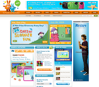
 Check it out for yourself. A site intended for kids ages 2-10 should be very graphic-intensive. There's just WAY too much text. You've got to assume that a HUGE part of their demographic can't read, or at least can't read very well, and certainly can't navigate all the drop-down menus and heavily scrolling pages. And it makes kids choose the shows they want to view from a list of shows. A text list. Without even an icon showing a character from the shows. Ridiculous.
 And in another stunning display of sheer web design ignorance, they have audio and video that blast out from the main page as soon as it loads. Users should have to interact with a page before it bombards them with media. They should ask for it, not be forced to endure it. Imagine opening this site at the library (where a lot of kids use the internet) and having to frantically scramble to either close the page or mute the volume before a lynch mob of librarians forms.
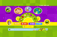
 A very well designed site for kids is still the fantastic PBSKids site. It's very easy to use (my daughter has been able to navigate it successfully since she was three), uses lots of easy to understand pictures and reads the text for kids who can't read. You get what you expect to get and can find what you want quickly.
Shame on Nick, Jr.. Poor usability in the realm of kids web design is a major sin. You can BS adult and force them to use your crappy site, but kids aren't going to stand for it or take the time to learn how to use your site. They'll move on to any one of the millions of really well-designed sites out there for kids.


No comments:
Post a Comment